Making a manga app
The problem: Anime fans and geek want to read new content not available physically in stores.
The goal: Design a manga reader app that allows users to easily select and bookmar japanese comics.
Research: I conducted questionares and surveys. Created empathy maps to understand the users needs. A group identified through the research was young adults between 18-24 that are into anime..
This user group confirmed initial assumptions for the Ramen app, but it also revealed that people from other fandoms like american superheroe comics are into japanese comics.
- Users are in need of recomendations
- Users want something simple to use
- Users want more content not available in other mediums
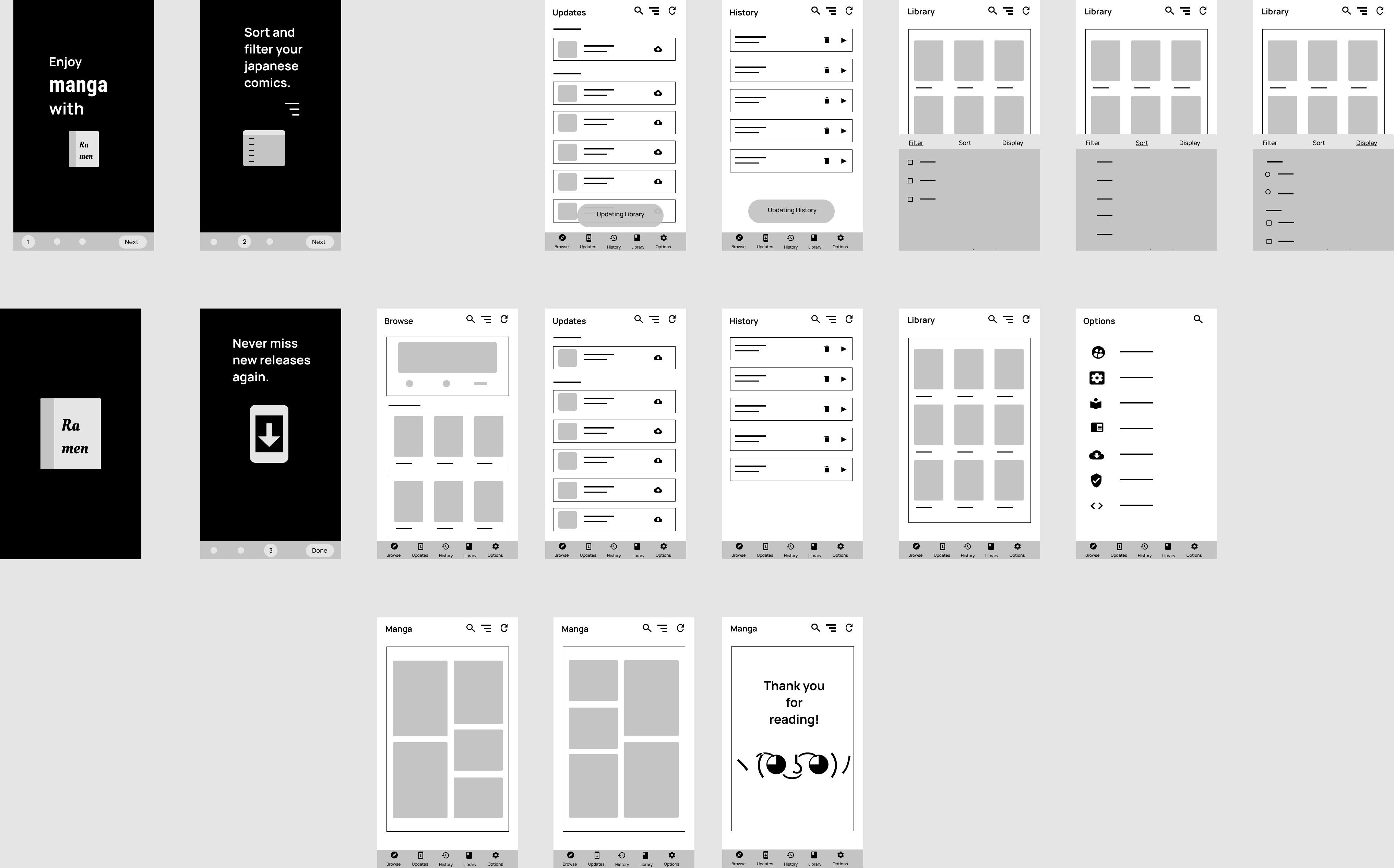
Wireframes
As the initial design phase continued, I made sure to base the screen mimicking other apps that offer similar features.
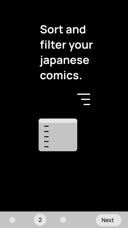
Low-Fidelity Prototype
The low-fidelity prototype that connects the primary user flow of selecting a japanese comic in the app and switching between sections.
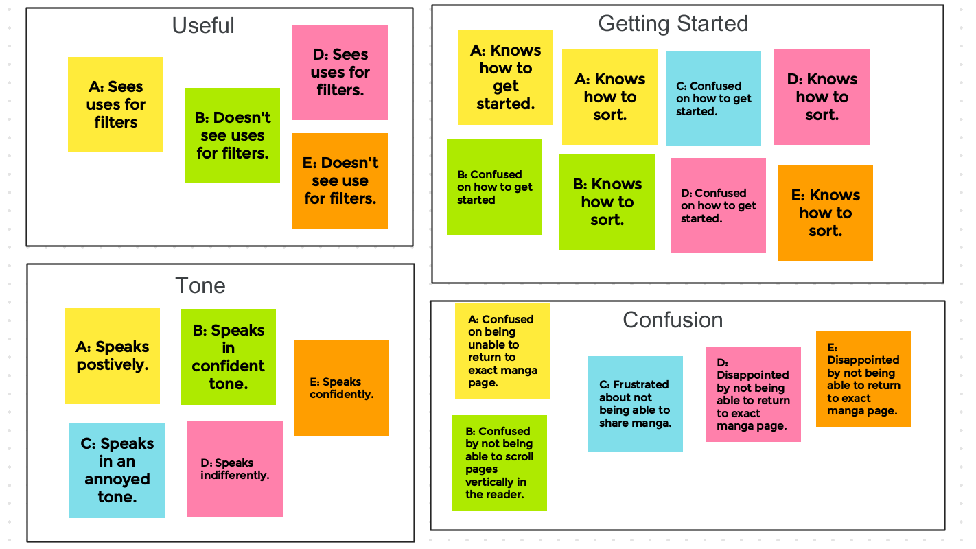
Usability Study
I conducted a usability study with the prototype to hep improve the design.
- Users did not know about filtering
- Users found the transition between the selecting manga and reading rough.
- Users got confused between update section and history
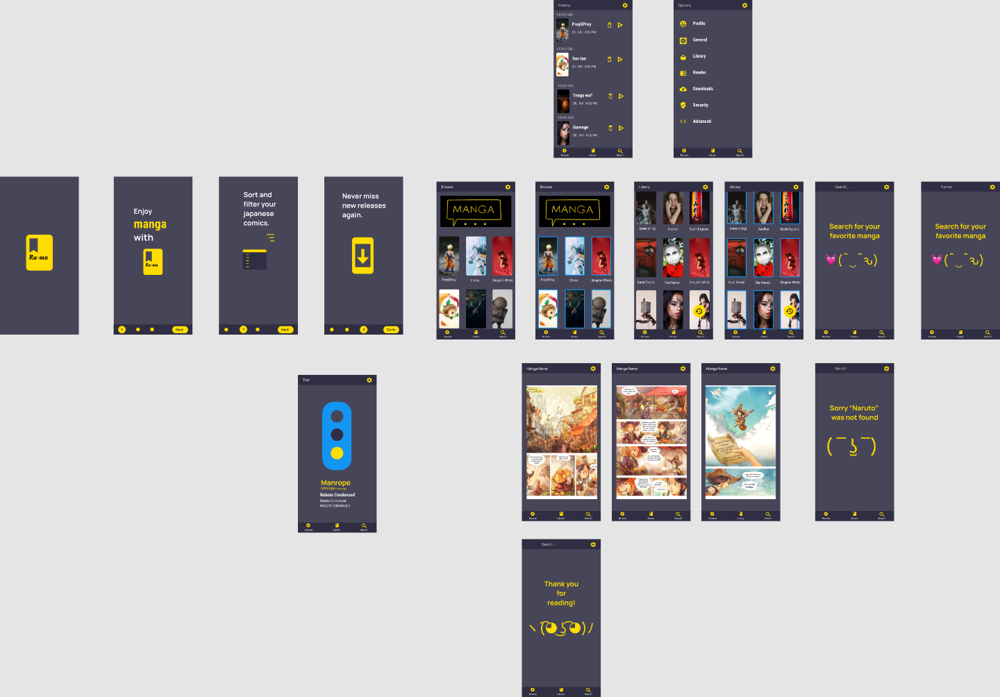
Mockup
Earlier designs had too many sections. After the usability study, this has been simplify for the user. Now intead of having 5 sections in the main navigation bar, it has been reduced to three.
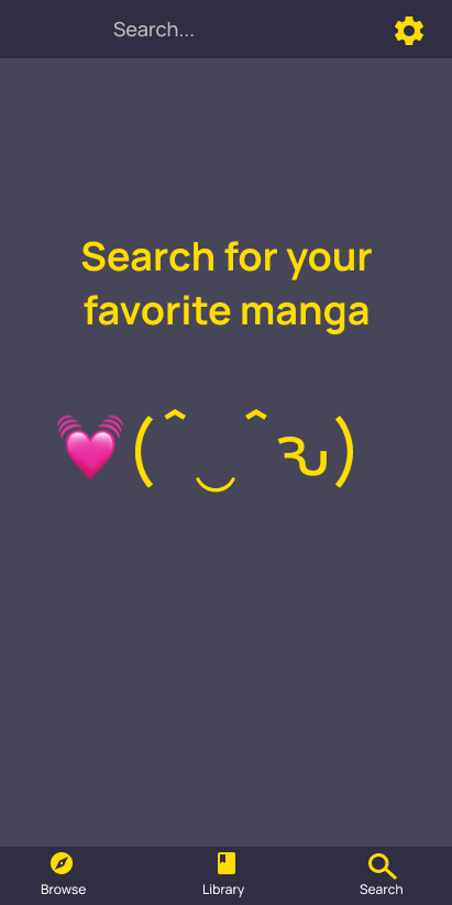
High-fidelity prototype
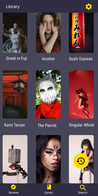
The final high-fidelity prototype simlifies navigation. Now it includes more visual feedback in the form of quick intro and highlights.
key takeaways
While designing the Ramen manga app, I learn that first ideas are the beginning of a proccess. Getting feedback from the users is the buiding block for making an app’s design.
 Harryson